Brand Identity
A brand people
recognise on sight.
Strategic identity systems — logo direction, colour, typography and the rules that hold them together. Built so everything you publish looks like it came from the same company.
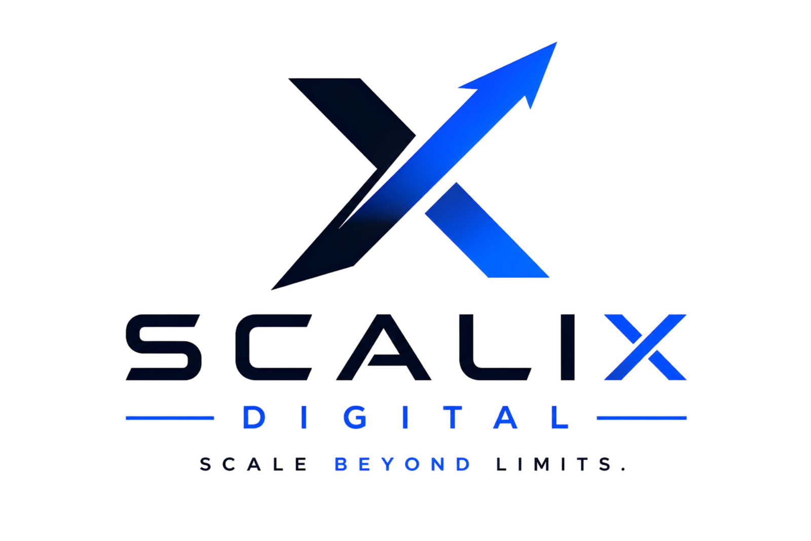 Primary lockup
Plus Jakarta SansBody & UI
 Icon mark
Favicon · avatar · watermark
Icon mark
Favicon · avatar · watermark
The Theory
A logo is an asset.
A brand is a system.
Most businesses buy a logo and assume they've bought a brand. Then the ads don't match the website, the proposal deck uses a different blue, and six months later nobody can tell your material apart from a competitor's.
A brand identity is the set of rules that stop that happening. It defines which colour does which job, how big a heading is relative to body text, how much clear space the mark needs, and what to do when someone needs a square version for a social avatar at 8pm on a Friday.
Why consistency is a commercial asset
Recognition is repetition. A buyer who has seen your same visual signature five times in different places arrives at your site already half-convinced — not because the design is beautiful, but because it's familiar. Inconsistency resets that counter to zero every time.
Why strategy comes before aesthetics
"Make it look premium" isn't a brief. Who you're for, what you're competing against and what you want someone to feel in the first four seconds — those answers decide whether the mark should be sharp or soft, the palette confident or restrained. Aesthetics without that is decoration with a bill attached.
Why the guidelines matter more than the logo
You'll use the logo once. You'll use the system every day — in ads, decks, invoices, signage and social posts, often made by people who weren't in the design meeting. A brand that only works when the designer is in the room isn't finished.
Distinct
Different enough from the category that someone can identify you before they read the name.
Consistent
Defined roles for every colour, size and spacing rule, so nothing drifts across channels.
Flexible
Works at 16px as a favicon and on a building. Light backgrounds, dark backgrounds, print and screen.
Usable
Documented well enough that your team applies it correctly without asking a designer first.
What You Get
The whole system,
documented and yours.
Logo & lockups
Primary lockup, icon mark, horizontal and stacked variants, plus light and dark versions for every context.
Colour system
Not just a palette — defined roles. Which colour is background, which is action, which is accent, and the contrast rules that keep it accessible.
Typography scale
A display and body pairing with a fixed scale for headings, body and UI — so hierarchy is consistent on every page and every deck.
Brand guidelines
A working document: clear space, minimum sizes, what not to do, colour codes for print and screen, and real usage examples.
Templates & assets
Social templates, ad frames, email headers and presentation slides — so the system survives contact with a busy Tuesday.
Collateral & print
Business cards, signage direction, packaging and document styling — with print colour values that actually match the screen.
Why It Converts
Brand does the work
before the pitch starts.
Identity isn't decoration sitting outside the funnel — it's what carries someone through the top of it. Here's the job it does at each stage.
Notice
"That looks different."Recall
"I've seen these before."Trust
"They look established."Prefer
"These feel like my kind of firm."Choose
"Let's talk to them."Distinct in a sea of sameness
Most competitors in your category use the same three colours and the same stock imagery. A deliberate visual territory is the cheapest way to stop scrolling.
The same signature, everywhere
Ad, profile, invoice, site. Consistent application means each impression compounds instead of starting over.
Looking your size, or bigger
Buyers read polish as capability. A coherent system signals a business that finishes things — before anyone reads a case study.
Signalling who you're for
Tone, colour and type quietly tell a visitor whether you serve enterprise or startups, budget or premium. The right people self-select in.
Less to argue about
When the brand has already done the credibility work, the call is about scope and timing — not about whether you're the real thing.
How It Runs
Five phases,
three to five weeks.
Discover
Positioning, audience, competitor audit and the words you want people to use about you.
Week 1Territory
Visual direction boards. We agree the feel before anyone draws a mark, so revisions are cheap.
Week 1–2Design
Mark, lockups, colour and type explored properly, then narrowed to one direction and refined.
Week 2–4System
Rules, scales, templates and applications built out across the places you actually publish.
Week 4–5Handover
Guidelines document, every file format you'll need, and a walkthrough with your team.
Week 5Case Study
Luxe Claim —
credibility in a trust-first category.
In claims, the first judgement a visitor makes is whether you're legitimate. The identity had to carry that before a single word was read.

Looking legitimate, instantly
Claims is a category crowded with lookalike operators, and prospects are cautious by default. There was no consistent visual signature to separate the business from the noise, and every touchpoint looked like it came from a different company.
Premium restraint, not decoration
We took the identity toward confidence and clarity rather than ornament — the visual language of a firm that handles serious matters. Every element was chosen to be reproducible by the team, not just by a designer.
What we delivered
- ✓Logo direction and lockup set
- ✓Colour system with defined roles
- ✓Typography scale for web and print
- ✓Applied identity across the website
- ✓Funnel and landing page design
- ✓Usage rules for the internal team
One company, one voice
Luxe Claim now presents a single consistent identity across its site and funnel, with rules the team can apply without a designer in the loop. New pages and campaigns ship looking like they belong, instead of being rebuilt from scratch each time.
FAQ
Before you
commission anyone.
Brand work is usually scoped inside a Scale ($5,000+) or Authority ($10,000+) engagement, or quoted standalone depending on how much of the system you need. Number of applications, print requirements and how many directions you want explored all affect it — you'll have the figure in writing before anything starts.
Three to five weeks for a full identity system. The variable is feedback speed — brand decisions need the actual decision-maker in the room, so we agree who signs off before we start rather than discovering it at revision four.
We present one strongly-argued direction, not eight variations to pick from. Ten options feels generous but usually means the strategy wasn't settled — and choosing by committee produces the safest option, not the best one. You get revision rounds on the chosen direction.
Often that's the right call. If your mark carries real recognition, throwing it away destroys equity you've already paid for. We audit what's working, keep it, and rebuild the system around it — colour, type, spacing and application usually do most of the heavy lifting.
Vector source files, plus exports in every format you'll realistically need — SVG, PNG, and print-ready versions in light and dark. Colour values are supplied for both screen and print, and the guidelines document explains where each version belongs.
Yes. Full ownership of the final identity and source files transfers to you on completion, with no ongoing licence fee. We'd also recommend checking trademark availability in your market before launch — we can flag obvious conflicts, but registration is a legal matter for a qualified attorney.
Ready to look like the company you've become?
Tell us where you're trying to go. We'll come back with a clear path, scope and next step — usually within one business day.